Friday, 28 June 2013

Read more about Methods of Upgrading to Magento Without Any Loss of Data


If you are one of the seasoned 
Magento store administrators, then by this time you must have learnt that Magento can be complex software. Still, if you wish to effectively upgrade your Magento website from any versions to the latest version without hampering the data, I must inform you that although it is possible but it needs a lot of effort and practical knowledge.
Magento is an enormous eCommerce platform for building shopping cart. The Magento community and its developers keep upgrading new version of Magento in the eCommerce market with the new structured development. It is natural that every online merchant wants to upgrade Magento’s latest version to efficiently run their business.
In this context, nearly after five years later, Magento released its latest version of Magento 2.0. With this latest version, the performance of Magento is expected to increase by at least 20% than its previous version.


There are a host of different methods to upgrade Magento. However, before that, the practice of proper backups is mandatory. What do you think is important for backups of a Magento store? Is it the files which contain your product images, themes and extensions? Or is it the database, where all your customer’s orders, data and product information are stored? Well, for an online merchant both are important.
Before, I tell you how to successfully upgrade your Magento store; I must share the precautions you should take before upgrading a Magento application: Take a quick look at it.

Warnings:

Maintain a complete backup of all the previous files, packages, database, and folders before upgrading any application. Creating a backup is of utmost priority especially for the cPanel users and the DirectAdmin users
Always keep your older source ready to use in case the upgraded version of the application stops functioning properly
Before upgrading the new version of Magento, you should be thoroughly equipped with the new features and modifications made in the application.
As you know the measures to protect your data, you are ready to upgrade Magento. Therefore, let me help you with some of the core techniques.

You can call this a Magento to Magento import. There are extensions available to allow you to transfer all your database items across another version of Magento. So how do you benefit from this? It allows you to retain a fresh installation of Magento and port across the essential themes and extensions and then migrate your data.
Within each Magento installation, you can easily upgrade Magento via Magento Connect. The steps to upgrade via Magento Connect include:
  • Login to the Magento admin
  • Move to system- Magento Connect- Connect manager
  • Login to Magento Connect
  • Click on ‘check for upgrades’
  • Upgrade ‘Mage _All_Latest’. This will upgrade Magento.

Magento’s huge file system contains abundant upgrade scripts. These upgrade scripts are responsible for programmatically updating your database for every single module that makes up Magento. Whenever a new version of Magento is released, the scripts increase in size especially whenever any modification of the database is required.


Login through secure shell by using puTTY, an SSH client. Connect to your server’s hostname or to the IP or domain name and login using your hosting control panel username and password. As soon as you access your site via SSH, back up Magento.
The many methods of manually upgrading Magento:
Install new version of Magento into Development domain:
Install a latest version of Magento on your development domain first. These include all the new database and files. Simply run the browser-based installer. As soon as the new Magento website starts functioning, start porting across all the old files that you want to keep.
Copy all files you want to keep:
You will have to port all the theme files, custom layouts and extensions from the old website to the new installation you had done before this step. Some of these include the followings:
  • App/code/local
  • App/skin/front-end
  • App/etc/module
  • App/skin/adminhtml
  • App/code/community
Remove Local.XML:

The local.XML should be removed to make Magento aware of the new installation. Simply delete and rename local.XML as app/etc/local.XML in the development domain.

Import old database:

Create a new database on the server and import the previous database dump from the old website. One of the easiest way to import or export database is through SSH (Secure Shell). Once the database is imported refresh the development domain homepage. This is done to trigger the installation scripts.
Run the installer with the new files on old database:
The new files contain MySQL upgrade scripts for all the key functionality of Magento. Here you will find that through the installation process Magento picks up all that you have connected to the older database.
Troubleshooting to set the site live:
Perform the following troubleshooting steps once the upgrade script has run-
  • Clear the cache
  • Perform re-index of all data
  • Test the site thoroughly
After upgrading Magento, you should opt for quality testing for the upgraded Magento version. It is done to ensure the systematic functioning of Magento. However, you can use quality testing tools as released by Magento to ensure proper working of your web application. The greatest advantage of using such tools is to increase the stability of your online web store.
Upgrading Magento includes the following features:
After you have successfully upgraded Magento, check out whether the following features are updated-
  • Magento theme update to make your website look effective and professional
  • Magento debugging updates to ensure database security for your online shop
  • Magento template upgradation for better promotion of your online business
  • Magento website upgradation to benefit from the latest features and functions of the new version
  • Magento 3rd party extension upgrades to deliver best upgrade services without losing vital information and data.


Sunday, 23 June 2013

Anger Management: The Modal Experiment


How many times have you seen modal windows that cover the whole area of your browser window with a semi transparent layer? Probably lots of times…actually modal windows are very important they work as an interrupter on a way of the user with some required action.

Modal windows are intended to grab user’s full attention. People may not recognize that a modal window requires their attention, leading to confusion about the main window being non-responsive, or causing loss of the user’s data input intended for the main window.

Example#1: I’m an average Internet user, I use Google to find info I need. So I googled the phrase “the funniest cats”, I’m offered about 9,230,000 results. I hit one of those links, website page opens and what I see is a blackout…the modal window appears and makes me do actions I don’t want to fulfill…anger trigger #1.

Those actions may include either subscription to a newsletter or social media sharing. And here comes that very moment when devs divide into two groups: first one allows skipping this window (by pressing Esc or the cross), the second group makes the action in the modal window obligatory, and that’s the…anger trigger #2.

Example #2: I accidentally came across some website through search results. I’m not yet sure if this website is useful for me, so why should I subscribe and allow this resource access my info in the social network? There are two options:

Option one: I can grant access to my info, browse this website, in case it will be of no use for me I’ll have to disallow it via the setting in my social media profile…anger trigger #3.

Option two: I’ll close this website and will never visit it again because of this damned window…outburst of rage extinguished 

But what exactly interface designers think about modal windows? A modal window forces users to complete the action before going back to the browser window. This makes users more productive because they’re doing one action at a time instead of multi-tasking. Users are less likely to get confused and lost in their workflow because of the control and constraint modal windows have.

Yeah, right. Forcing someone do something is a lost cause…this is why offering alternative options is really important for every user.

So how to do it right without irritating any of your visitors?

Add closing cross to make the required action in the window optional…


or the Close button


Anyway, these were just three anger triggers from others possible. If you had any experience creating or you’ve seen some examples of modal windows that enraged you with their meddlesomeness use the comments below to describe your feelings.


Importance of Usability Trackers: Five Best Tools

Much have already been said about website usability, especially about process of creating perfect browsing experience for users. In case you’ve already used each and every method you found to be appropriate, time to make use of usability trackers. Those are manhandled tools (mostly) that test all aspects of your website.

Why do you need usability testing?

Jared Spool knows the answer to this question, his most prominent testing projects was later called 300 million button. It was like this…there was some online store…the store master wanted to improve conversion and increase sales but nothing worked, so he called Jared Spool and miracle happened. The site was carefully checked and only one thing was changed. The Register button in the checkout was replaced with Continue thus allowing users who don’t want to register by stuff without obtrusive registration. Right above the continue button they’ve places following message.
You do not need to create an account to make purchases on our site. Simply click Continue to proceed to checkout. To make your future purchases even faster, you can create an account during checkout.”

Cool, huh?

If you’re running online store have you considered the possibility that one single button can set you apart from weighty profits? With usability testing tools researchers can spend a fraction of the cost to obtain results that are close to the traditional usability testing facility results that may cost thousands. And just as significant, results can now be gathered and analyzed in a matter of an hour.

Please be advised

Of course, just because testing tools are available at a fraction of a cost it doesn’t mean that anyone can and should use the tool. As with most other tools, the analysis and the recommendations about what to do are based on the report’s expertise. As with other professionals such as dentists or doctors, it’s the knowledge that comes with training and years of experience that guides the hand that uses the tool.
So here are five most impressive usability trackers that will drive unprecedented usability to your website/store/blog.

Concept Feedback is designed as a way to gather input and feedback from experts about new designs for marketing or advertising purposes. Concept Feedback community of experts is available free of charge. It works quite simply, you submit your concept to the expert community, and reviewers provide their suggestions, recommendations and input about your design.
***


Chalkmark provides a means of sharing an image with a user to gather feedback on where the user would click to perform a task. From a usability testing perspective, this is the same concept as a reverse card sort, which means the terminology and navigation are tested to ensure users know where to go to accomplish a task.
***


ClickTale is a paid hosted service that tracks user keystrokes, mouse clicks and moves, and the time it takes for users to move around a web page. Single user sessions are saved as a movie with a large round circle around the user’s cursor so it’s easier to see.
***


CrazyEgg is a popular click tracking usability tool which has the ability to display large number of interesting data based on clicks. These data displays include heatmaps of the more popular locations of clicks on a page, lists and overlays.
***


The principle of Feng-GUI resolves around their belief that human eye movement can be replicated based on variable on the page, along with typical actions the average human makes.
***

Today usability testing can be conducted easily & quickly without expensive facility charges that used to be required. Because of the great variety of usability tools, researchers have unprecedented opportunities to evaluate, analyze and make recommendations for website improvements. This benefits the website owners, the usability researcher and the users, which is truly a win.


25 Latest Free Fonts for Professional Designers


90% of the info on the Internet are texts
. It’s quite logical that designers need to have a good basis when forming the look of written information on websites they create. There are lots of typography-based designs where font is the key element. That’s because devs have an opportunity to play with different types of fonts, thus create fascinating effects with Photoshop and CSS.
Choosing appropriate font can be really difficult; it involves lots of creativity and precision. Fonts should ‘organize published material’ so that visitors will not feel uncomfortable reading texts on your site. Otherwise you will not be able to get their attention and achieve the goal. Therefore, if you want to apply professional fonts for your designs that would be a great idea, but only if those fonts were created with much skill and professionalism.
Choosing the right typography will make site’s appearance look well and adequate. So, in this post we’ve collected examples of successful fonts for your inspiration. Each and every item from this list is absolutely free. Under the image you’ll see the list of numbers where you can download your preferable font.


1, 2, 3, 4, 5, 6, 7, 8, 9, 10, 11, 12, 13, 14, 15, 16, 17, 18, 19, 20, 21, 22, 23, 24, 25


-->

Wednesday, 19 June 2013

Success Ensuring Tricks to Create the Best eCommerce Store


Two opinions cannot be stated at this point that every business person is running after building an amazing shopping store that will handle the competitive online market. Though, the appearance of the store matters a lot, but what is more important as compared to designing factor is user experience. It means that even the best looking website would not be able to live up to the mark to customer expectation if it is not user-friendly. The responsibility of the web designer is to ensure easy accessibilitygood functionality and user-friendliness of the web store. Moreover, there must be a perfect blend of both beauty and the appealing presentation of the products and services.

We all know that designing is something that works wonders in the direction of earning the immediate attention of the visitors to your eCommerce store. Other than a powerful design, here are some tricks that ensure the consistent success of an online shop:
  • User-friendly Navigation: Visitors are not going to spend much time on your store, if it is not built with user-friendly navigation. So, ensure that you input this very factor in your store.
  • An Advanced Search System: This is the second major requisite that must be integrated with a shopping site to boost its functionality and confidence of customers within you.
  • The Look of the Products: There must be clear display of products description, cost, discounts and other special offers. This feature would enhance customer’s trust to your store.
  • Lesser Clicks: When a customer comes to your store and he has to bear so many clicks to reach his desired products, he loses his interest and leaves the site immediately. Therefore, you should make it an affair of lesser clicks.
  • Customers’ Support System: A proper customer support system should be embedded to attain the utmost satisfaction of buyers. And, highly responsive customer care system must be there to respond to the queries of shoppers in a detailed manner.
Let’s explore of the best eCommerce websites those set an example in every manner including superb website design, great user experience, appealing appearance and wonderful functionality:

Volkswagen

Volkswagen secures the topmost place in the line of the best automobile sellers. The entire credit goes to its striking eCommerce website design to showcase the different models of the offered cars. The showcasing of the cars has been set wonderfully incorporating the varied designs, colors, etc. Easy navigation, diverse payment options and convenient buying are some of the points that have transformed it into the brand name in the automobile industry.


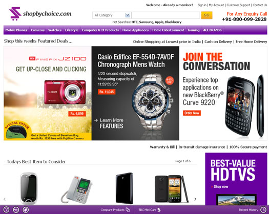
Shopbychoice

Shopbychoice is counted among the prominent shopping portals in India just because of its eye-catching web store design. This online shopping site is acclaimed for its simple to use features and friendly navigation. Almost every shopping category such as lifestyle, kitchen accessories, home appliances, electronics, tablets and Smartphone is served here. Every product has been added with a clear categorization, model, price, brand name and related things.


Doodern

Doodern is stated an ideal example that how, an eCommerce store should be designed, must look and can offer great functionality to the user. Its design certainly appeals shoppers because every product page has an ample description for the products and options for ensuring cordial seller-buyer relationship have been integrated. The best handmade items, decorative crafts, latest clothes and exclusive accessories are available here. Buyer’s protection system, international language & currency support and diverse delivery options are offered to enhance the online shopping experience.


Etsy

Etsy comes in the gamut of extensive eCommerce platforms that are capable of hosting a variety of small business stores. It has been perfectly designed for the shop owners who want to sell online vintage items, handmade products and cross-stitch patterns. Designing, presentation and user-friendliness all can be found on this well-known shopping platform.


Dune

When we are discussing the best designed ecommerce platform and do not count Dune, it would not be fair. The store has great thumbnails images to choose from the bottom and at the top, there is a navigation bar which enables to discover the diversified range of products. The images on its center page grab the immediate attention of the onlookers. Incorporated with the modern features, it carves a niche on the online shopping platform.

Teapot

Teapot makes its way into a list of the top and most eye-catching eCommerce website designs. In all terms, from the navigation bar to the engaging designing, it lives up to the mark to give an inspirational idea to get your own website designed.

The above mentioned website designs are ideal in terms of the fundamentals of the best eCommerce store design with admirable user-experience. All these designs appropriately explain that how to grasp the immediate attention of visitors by directing them to product navigation page easily.

MotoCMS HTML Just Got Better – Version 1.1.3 Released!


MotoCMS
 has just announced a new update of their control panel for HTML – the version 1.1.3 release. This latest update of the powerful content management system for HTML websites is a big jump forward for the System’s already-advanced suite of features. The new release makes website management more efficient and adds a bunch of useful options to the control panel.
Since web these days is more visual than ever, the update focuses mainly on the image gallery features to make your website stand out. Specifically, the release has brought a couple of cool widgets for image gallery creation. The features will definitely make it incredibly easy to organize images and display them in the most beautiful way. The new widgets are a big plus to a great collection of MotoCMS gallery tools that add some serious visual candy to websites powered by MotoCMS.
Read on to learn more about the new functionality that has been implemented in the MotoCMS control panel for HTML.

Reflection Gallery widget

Due to this new functionality, you can now add an impressive reflection effect under your photos. This effect gives any object the appearance as if it was settled on a very shiny surface. Now you can add this luxurious look to your images!


The Reflection Gallery widget includes the following features and options:
  • The widget height includes an image itself and its reflection as well;
  • The central image height is a half of the total widget height;
  • The thumbnails height equals 2/3 of the central image’s height;
  • The images width is set as auto;
  • You can set the reflected image’s transparency;
  • You can set the indent before the text all over the widget’s height;
  • The central image displays while loading;
  • The ability to set the space between images;
  • When clicking on the central image, the full size image will open in the lightbox with thumbnails;
  • The animation and rotation speed is set constantly;
  • The text which is set for an image, is displayed on the central image only.

Slider Gallery with Thumbnails

The Slider with Thumbnails widget delivers a great functionality to your website by providing a powerful and visually attractive sliding gallery for showcasing your images online. This advanced tool adds displaying your photos by sliding them and provides the image thumbnail preview which easily moves in sync with the main slider of the gallery.
The functionality of the Slider Gallery with Thumbnails is similar to the Slider widget, which has been added with the MotoCMS HTML 1.1 release. The only difference is that in addition to the main image slider of the widget, the thumbnail preview has been added. The thumbnails are browsed to the end and then moved back to the first image. The navigation is performed with the arrow buttons.
You can set the properties for the slider: set the slideshow duration, show (or hide) pagination, add descriptions to images as well as set their properties and more. Also, you can center the preview gallery when the whole block with thumbnails is displayed on the screen. Pretty cool, huh?

Why Web Design Badness Becomes Popular?

One of the most popular opinions among web designers is that the Internet is full of bad designs…well, there are bad ones for sure, but as you know one man’s meat is another man’s poison.
Someone likes flat style, someone is into Flash (making all those thing glitter all around the web page), someone else may like kitch. It’s hard to please everyone.
That’s the reason we are having so many styles and so many designs. Anyways, we can point out one thing that has some note of mysticism – this is the process when bad design elements turn into standards.
This is all in our heads…our psychology is that trigger that makes weird things. That’s the reason why something bad may turn into something heart warming. The brightest possible example from the real life, not web, is the Stockholm Syndrome.

Stockholm syndrome, or capture-bonding, is a psychological phenomenon in which hostages express empathy and sympathy and have positive feelings toward their captors or abusers, sometimes to the point of defending them, and sometimes the feeling of love for the captor shows. These feelings are generally considered irrational in light of the danger or risk endured by the victims, who essentially mistake a lack of abuse from their captors for an act of kindness.The FBI’s Hostage Barricade Database System shows that roughly 27% of victims show evidence of Stockholm syndrome.

***
It’s amazing but popularity works through two very different processes. The most intuitive for most of us is the ‘Fads and Fashions’ process. People, brands, and styles become popular because the right people have adopted it – rich people, celebrities, opinion leaders, hipsters in subcultures – and we copy them in the eternal human quest to be fashionable and admired. The emergence of cultural icons – a far more durable and powerful form of popularity, and much less well understood. Icons emerge because they express a particular ideology that is needed for a society.
Another one path is the Cultural Innovations, those are the internal changes that depend (and are limited) upon the recombination of already existing elements. They can occur independently in different times and places, however not all lead to change in culture. They occur more frequently in technologically complex societies than in less developed ones.
“Bad” designs are subjective
We all have different tastes and expectations. Even though lots of people think that flat design/ (insert any other you find appropriate) is an icon of the style…they will be right. Everyone is right in their own way, even those fans of Web 2.0 style (if there are any left). Bad designs are needed, here is a simple example from everyday life. Do you know why a beauty makes friends with a ‘not beauty’? She wants to look even prettier having such a friend that is a ‘3’ or ‘4’. Same thing with web design – we need all those ugly layouts to have things for comparison.

Users aren’t designers…mostly
Users make up a specialized and a huge part of webdesign community. As being specialists of their ‘user’s craft’, they are naturally aware of latest trends in website design and development, those who are, eventually learn that, venturing into technical gaffes and structural problems. The average user isn’t going to be anywhere near as likely to notice or care about all the little things that drive developers crazy. They just care that they’re given a good story.
Conversion is the king
Tough to swallow as it may sometimes be, you can’t argue with sales. If a gazillion of people loved some web resource, they’ve shared it all around social media networks, submitted tons of reviews, then the site’s technical “badness” just doesn’t matter. It may be shoddy, site with classical layout (a header, body, footer and a side bar, nothing else), but the very fact is that it’s selling. The news isn’t all bad especially for the owner, having a crappy design get a bunch of followers and regular visitors. At the end of the day, those are the visitors who decide what’s good and what’s not, and it’s their money that does the talking.
So why does it all happen?
Remember when Metro UI was introduced, not even the lazy bad-mouthed it. And what do we see now? Metro is still out there, on the tablets/laptops/desktops/smartphones, etc. Everyone considered it to be ugly and not user-friendly. Probably you don’t know that but designers of Metro style found their inspiration in Bauhaus school, that’s the German art trend of 30-s. Those artists were fond of drawing rectangles and squares in bright and sharp colors. So why Metro UI became popular? The answer is pretty simple, people got used to it, and when working they understood that it’s the most awesome UI created lately, even those who could not find Start button.
The same principle works with any other thing considered bad – we’re all getting used to it, that’s the matter of human evolution, we’re highly adapting species. If not this trait we would not develop from a cavemen into homosapiens in such a short period of time.